
Problem
An LMS is always a complex tool. Many users use this applications on a daily basis without knowing how to do it, which generates a lot of frustration.
Solution
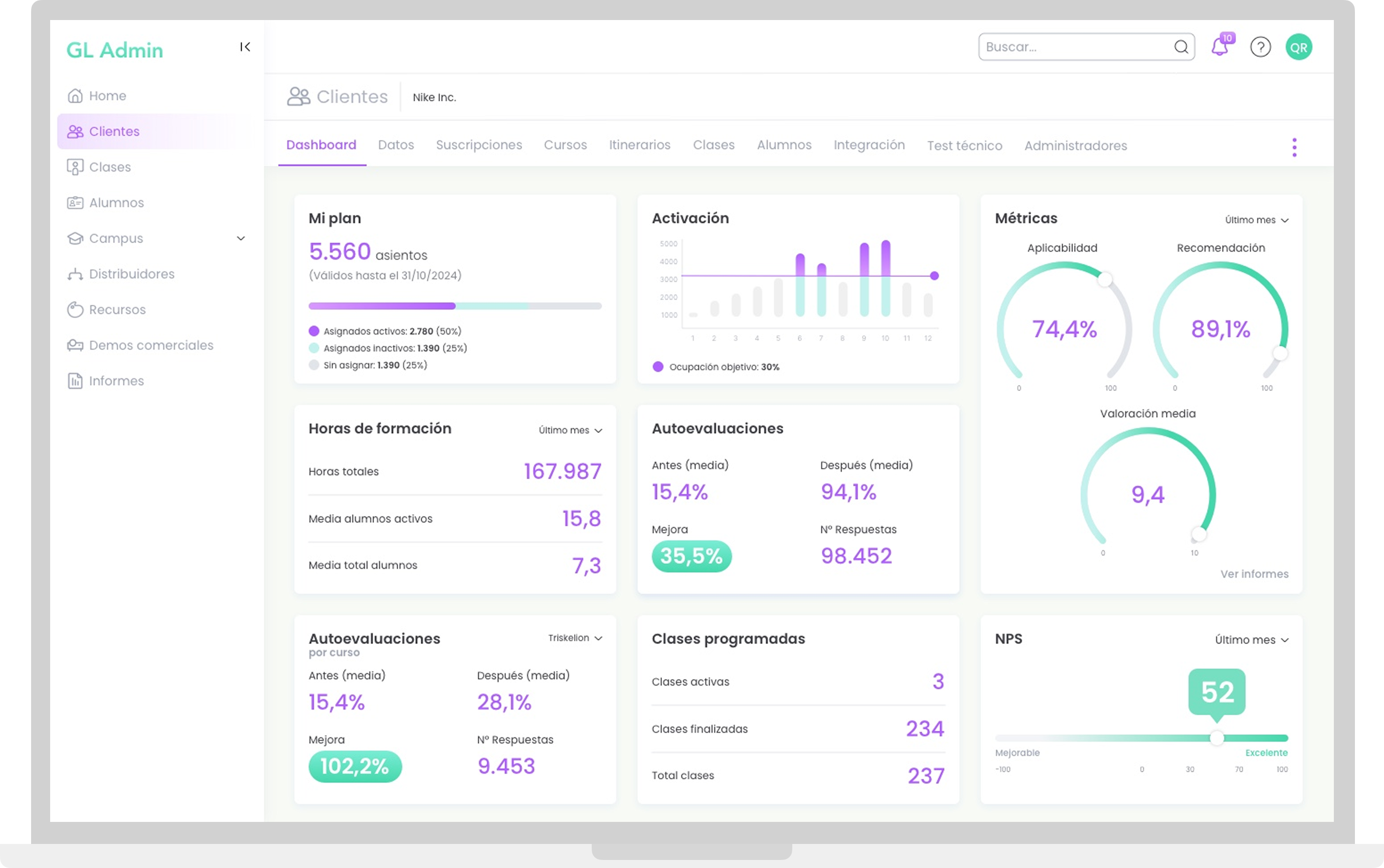
An alternative that offers easy and independent management of any educational process, understanding the software itself as a service and applying user-centric philosophy so he/she can comprehend any learning curve without minimal help.
Role
This product already existed for years, but its development was approached without carrying out a proper UX roadmap so, in time, it ended up being a collection of poorly thought out functionality.
I was assigned to thoroughly analyze the tool to create a synthesized, easy to understand user experience (UX) at all levels. As for UI needs, I have been in charge of all processes from 2023 on.
It is a project focused on continuous improvement.
What I did
- Product technical definition along with PO. Tools: Jira, Confluence
- Conceptualization and ideation (flowcharting + sketching). Tools: Hand drawing, Draw.io
- UX Design (wireframing). UI Design (from 2023) Tools: Figma + Craft
- Prototyping at different levels of detail. Tools: In Vision
- Knowledge transfer for UX writing and UI Tools: Slack, Google Suite (Meet, Docs, Chat)
- UI/Dev iterations follow up for releases. Tools: Zeplin, Jira, Confluence, Asana
- User interviews on possible features and tool perception. Tools: Google Suite (Meet, Docs, Chat)
Discovering needs
Goal
Management and distribution of individual or group learning contents for students, clients or third parties in general.
User persona
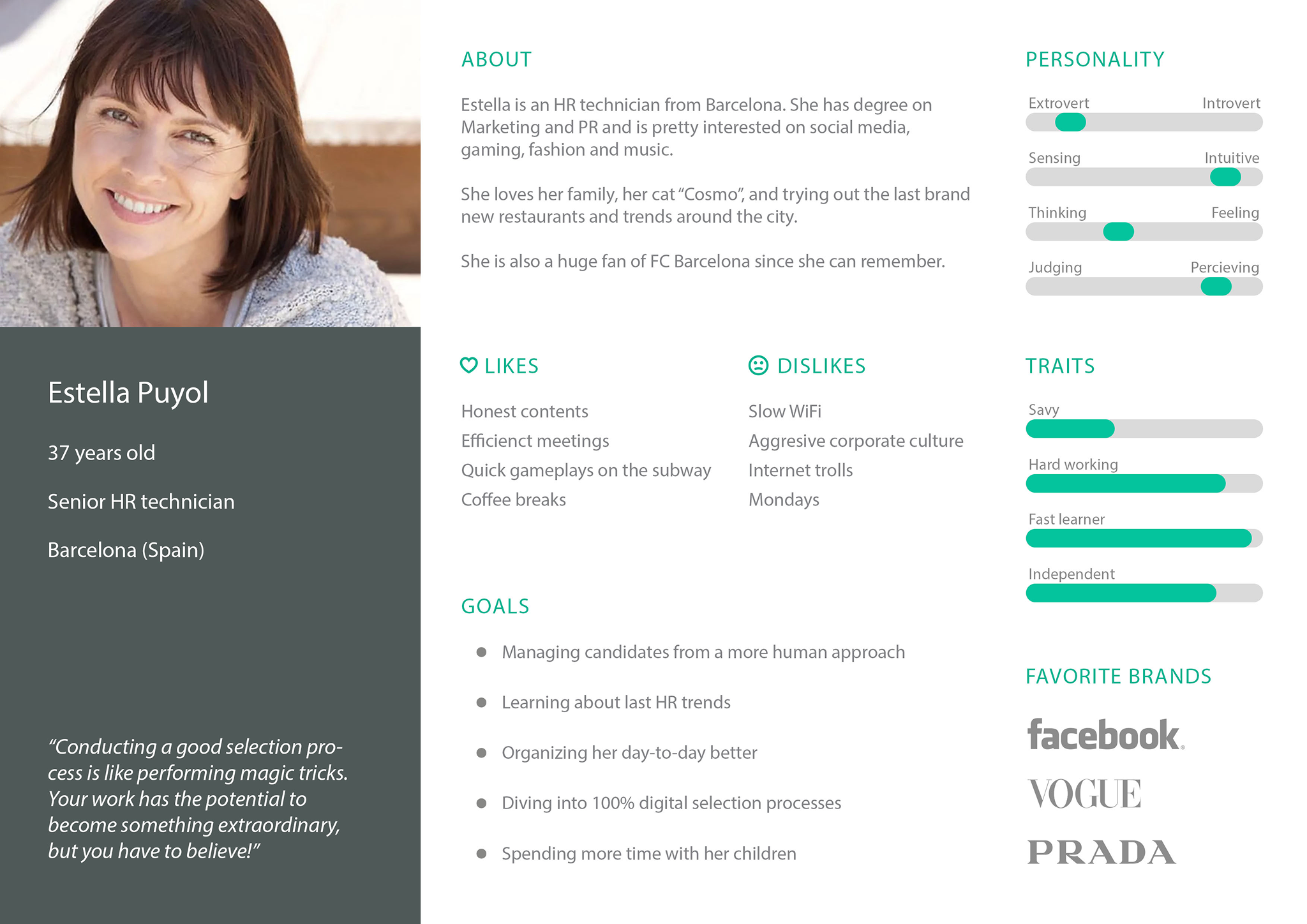
Mid aged content creators, Customer Service or Customer Success roles and administrators with:
Average tech profile.
Work-driven desktop apps use.
Casual mobile edition and gaming apps use.
User stories
As a content creator:
- I want to create and edit game-driven virtual classes, so I can provide engaging content for distribution.
- I want to create, manage, and distribute game-driven itineraries, so that I can provide my students with a contextualized training path to effectively orient it to their business goals and soft skills.
As a sales representative:
- I want to create and distribute commercial demos, so I can offer my content to further potential markets and clients in order to expand my business.
As an administrator:
- I want to manage and monitor student enrollment and follow-up, so I can ensure students are properly supported throughout their experience and reach their learning goals.
- I want to manage and monitor my clients, so I can provide them with the necessary support for tracking their enrolled students, if they might have them.
- I want to manage and monitor my clients administrators, so both me and my them have visibility on how they support the learning journeys.
- I want to create and consult reports based on class, student, customer, and survey data, so I can inform results properly to make data-driven decisions with an impact on business models.
Some good design choices
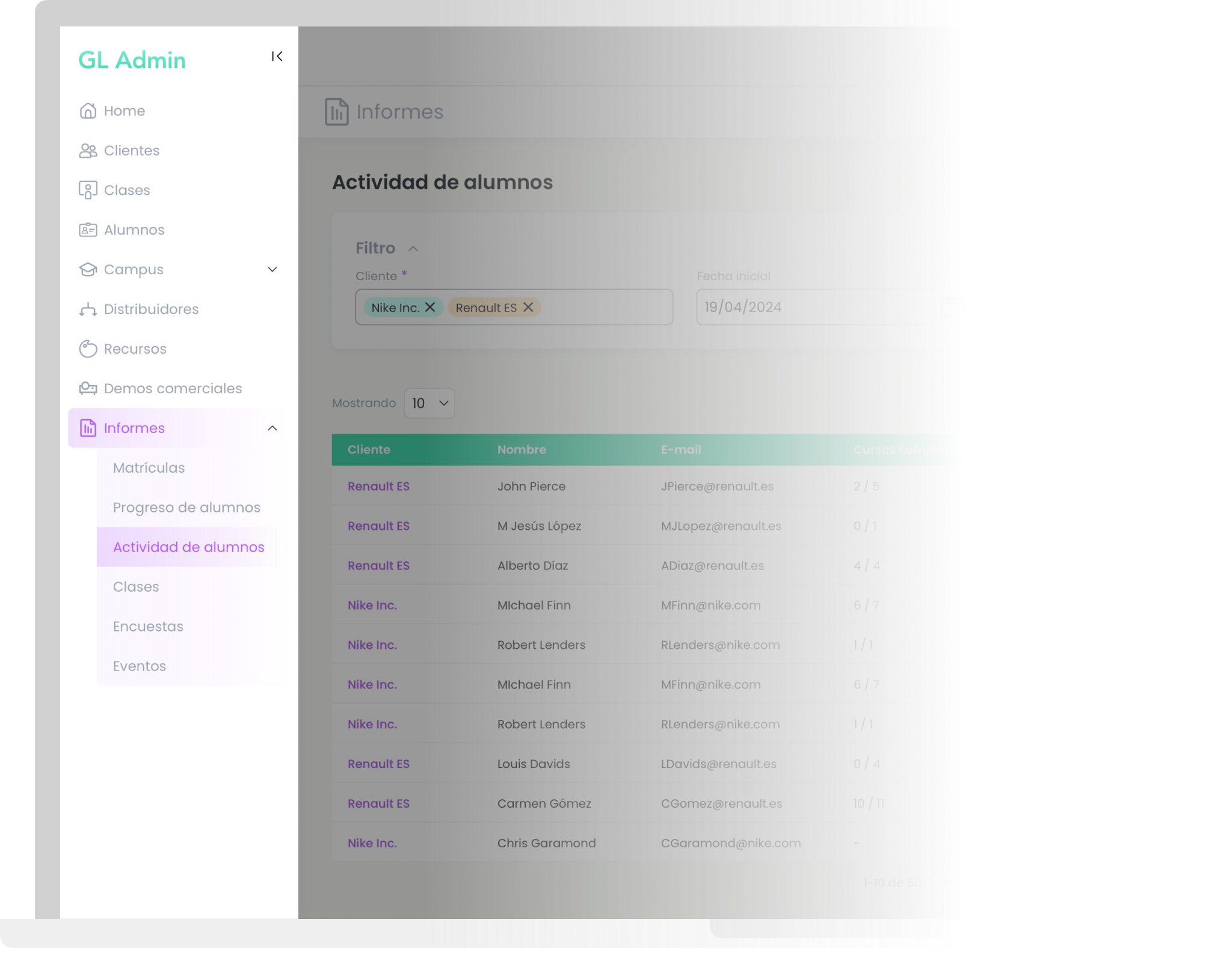
One of the most important features of the platform, especially for Client Success (CS) stakeholders, is the report management tool for enrollments, students, classes, surveys, and events.
During a product improvement meeting, it was reported to PO and UX that this department had a poor relationship with this section, resulting in a usage rate that dropped to 42% according to that Q metrics. This was because they started requesting data directly from the Business Intelligence team as a workaround.
Test into it
Through a series of individual user testing sessions with the CS team, I made two interesting discoveries:
Sectioning off reports at the master level made navigation a bit clumsy.
This could lead to reports being perceived as independent entities, which was not the intended approach.
Be nice and save thought
The key was to reduce the interaction to improve the lack of comprehension due to partial loss of context and to avoid a tedious experience. The way to achieve this was by addresing three main changes.
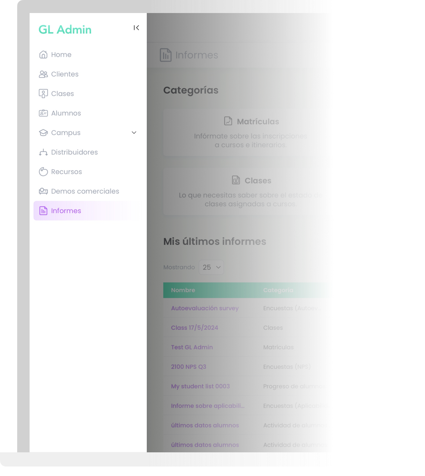
1. Merge all the existing sections into one (Reports), which would have a home page divided into two main parts.
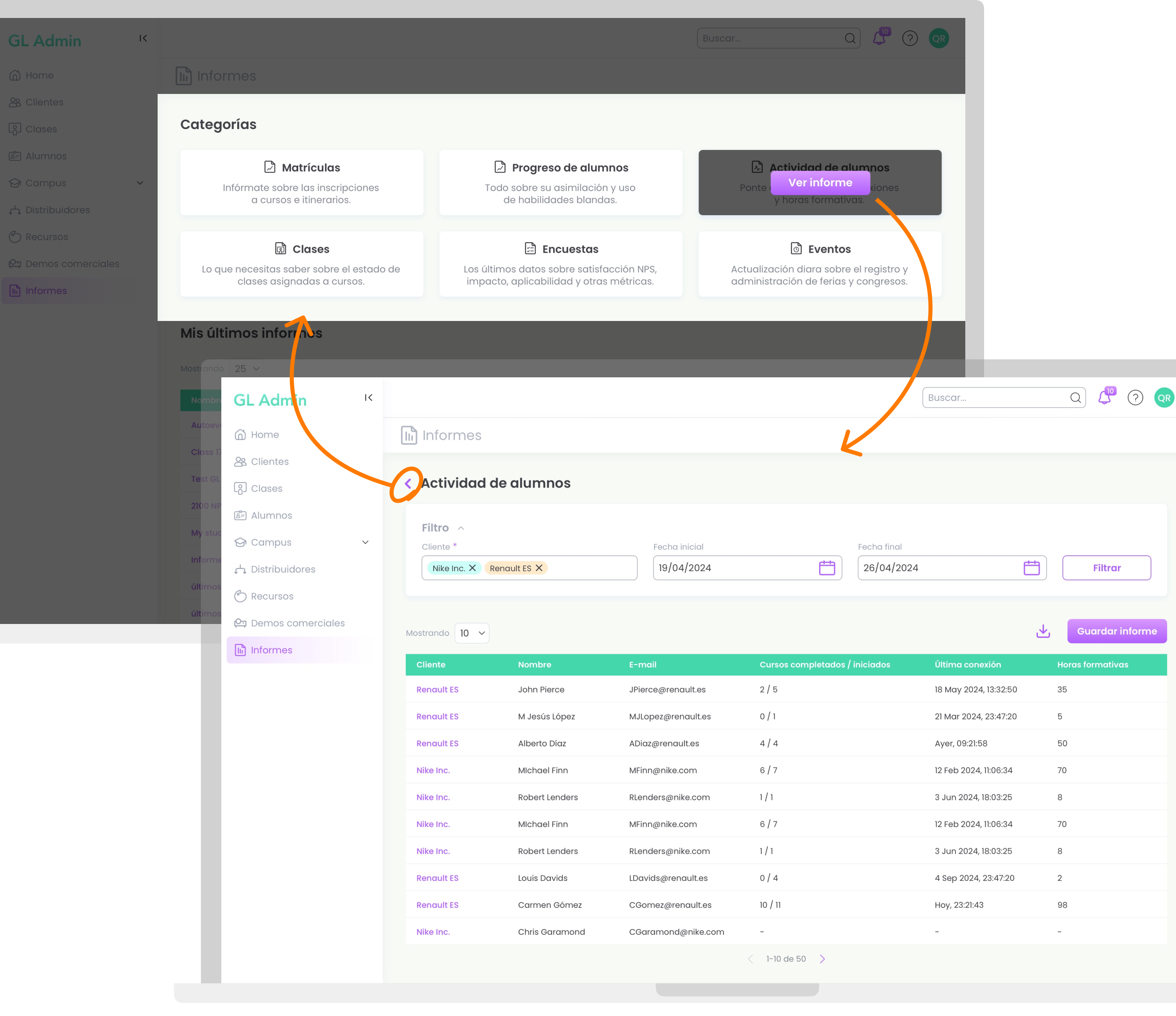
2. A grid card-based layout dividing the reports by type. The active zones would completely cover each card when hovering to facilitate interaction and save height, so user gets to see more content below it on first scroll.
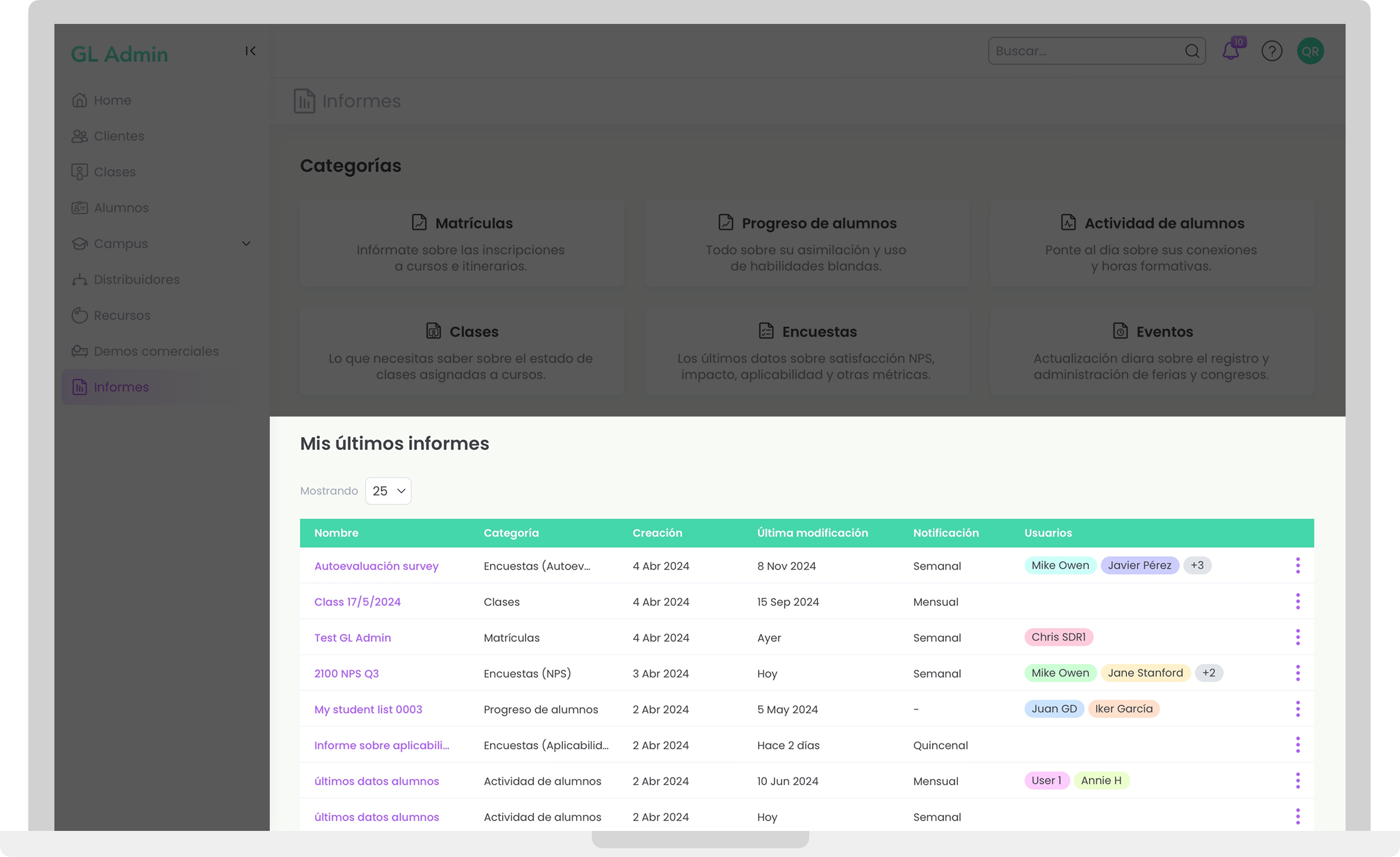
3. A list view of the user’s last created reports, so that they could be consulted without gaining access to each subsection every time.
Pick one!
An A/B test was performed, in which A would offer the existing system and B the new variant. For this purpose, the Customer Service and Support teams were randomly shown with both options, but I excluded CS since their reactions would be conditioned by A’s proven rejection
The results were revealing:
80% of the total (16 out of 20 testers) preferred B to A. The most widespread opinion was the greater fluidity due to the new categorization.
Edit and organize existing characters.
As for CS, monthly metrics after the production deployment that included this solution reflected a -93% drop in requests for BI.
A catch: resources management for comms
Problem
A resource database is available to be used for commercial initiatives of all kind. After conducting a number of focus groups and internal stakeholders testing and interviews, I identified its usefulness was diminished by the difficulty in finding the right material, which lead to either giving up search tasks or using contents from the search results fall (in other words, the first page), avoiding pagination.
This was due to its size, which also grows exponentially, and had a negative impact in the quality and scope of the campaigns and demos, shaping as a severe pain point for commercial and marketing roles.
Solution
An advanced but easy-to-understand filtering system is proposed to reduce this time investment, so user can focus on developing campaigns or initiatives in general.
In a following prototype-based functionality test, the average search time was significantly reduced for most testers.
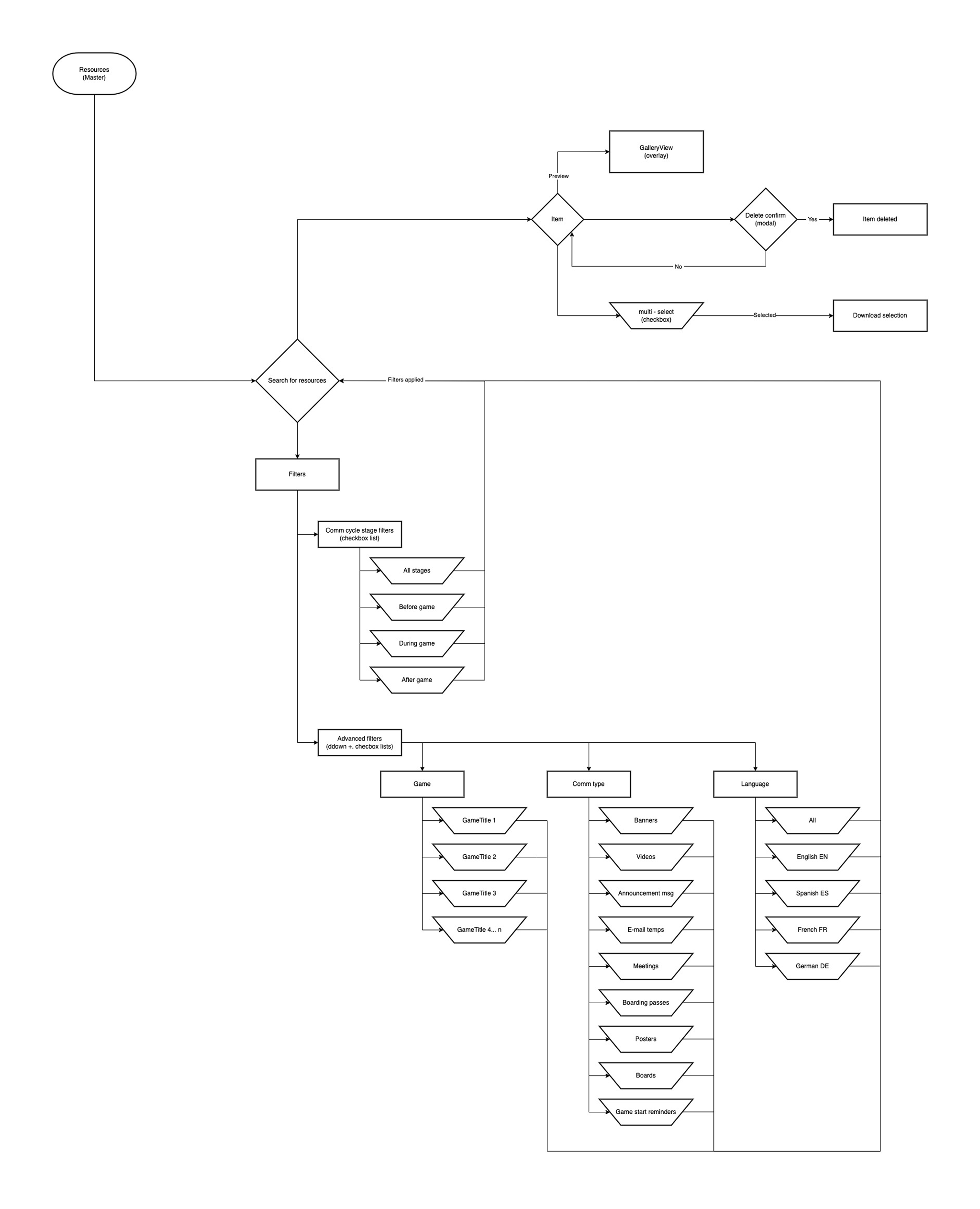
Flowchart
I tried to think of a flow that would reduce the user's investment of time and abstraction, so that they would be able to find any type of item without having to think too much about the search process and be able to focus on the important.
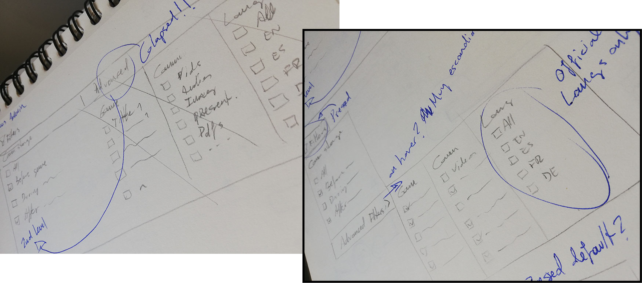
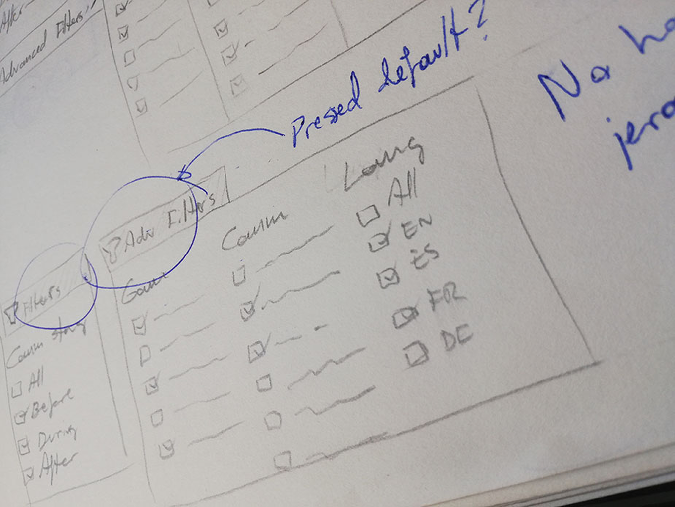
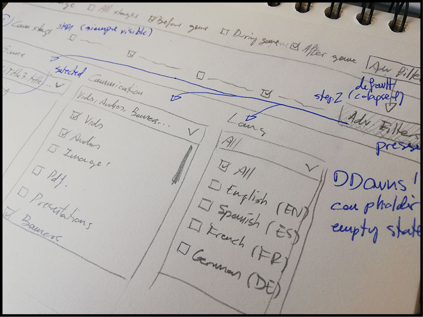
Sketches
To ideate this flow, I dissociated the filtering into two levels:
1. General. Based on where in the game the player is.
2. Advanced. A multi-select dropdown sublevel, which offers fine search parameters according to course, type of resource and language. It could reset all up in one click.
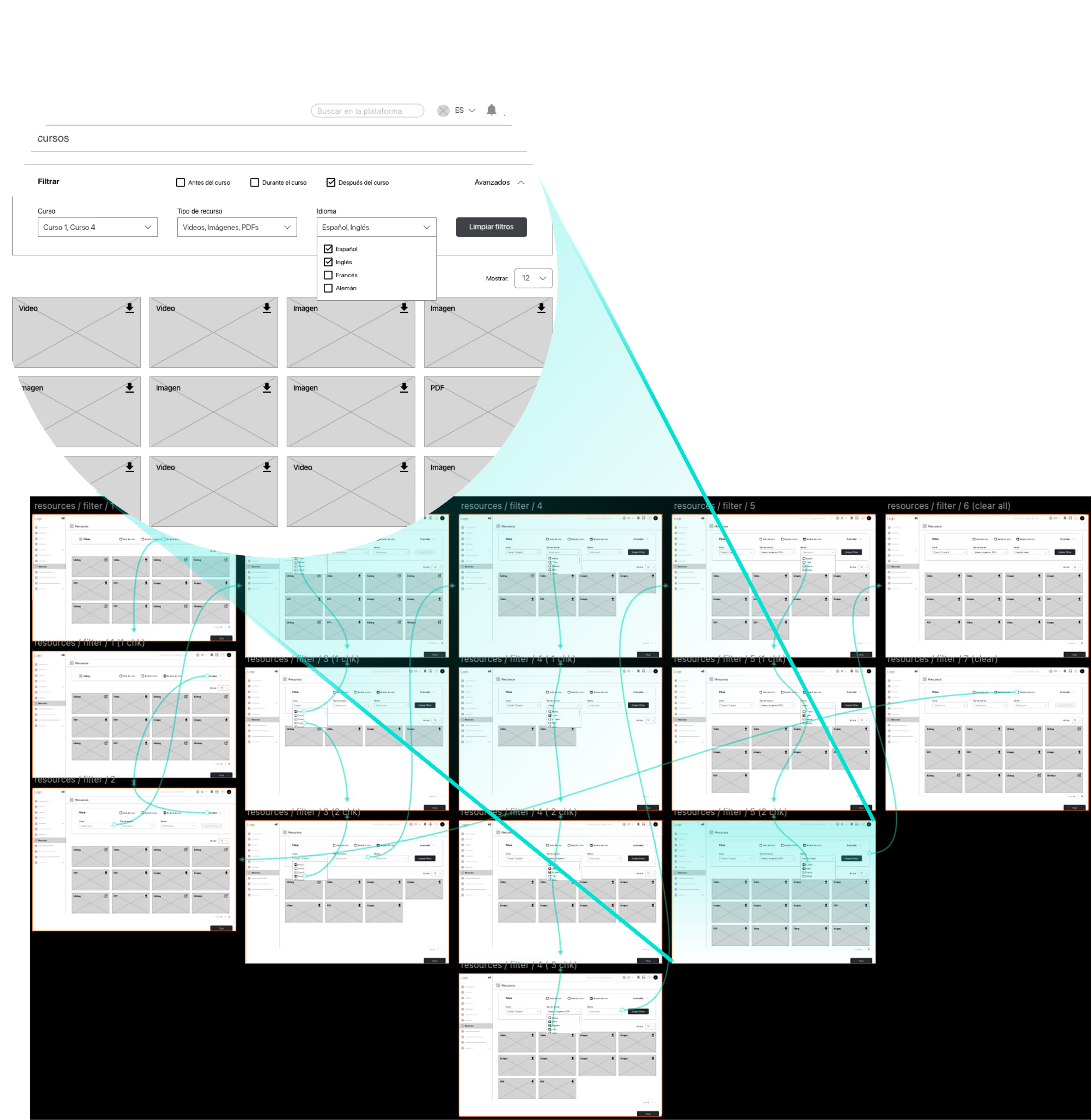
UX flow
I started from the section original structure to integrate filtering so that it was easy to find, but not bothering if it was not to be used. To tackle it, I proposed a grouped view on top the resource grid that would optimize the filtering levels according to the user needs.
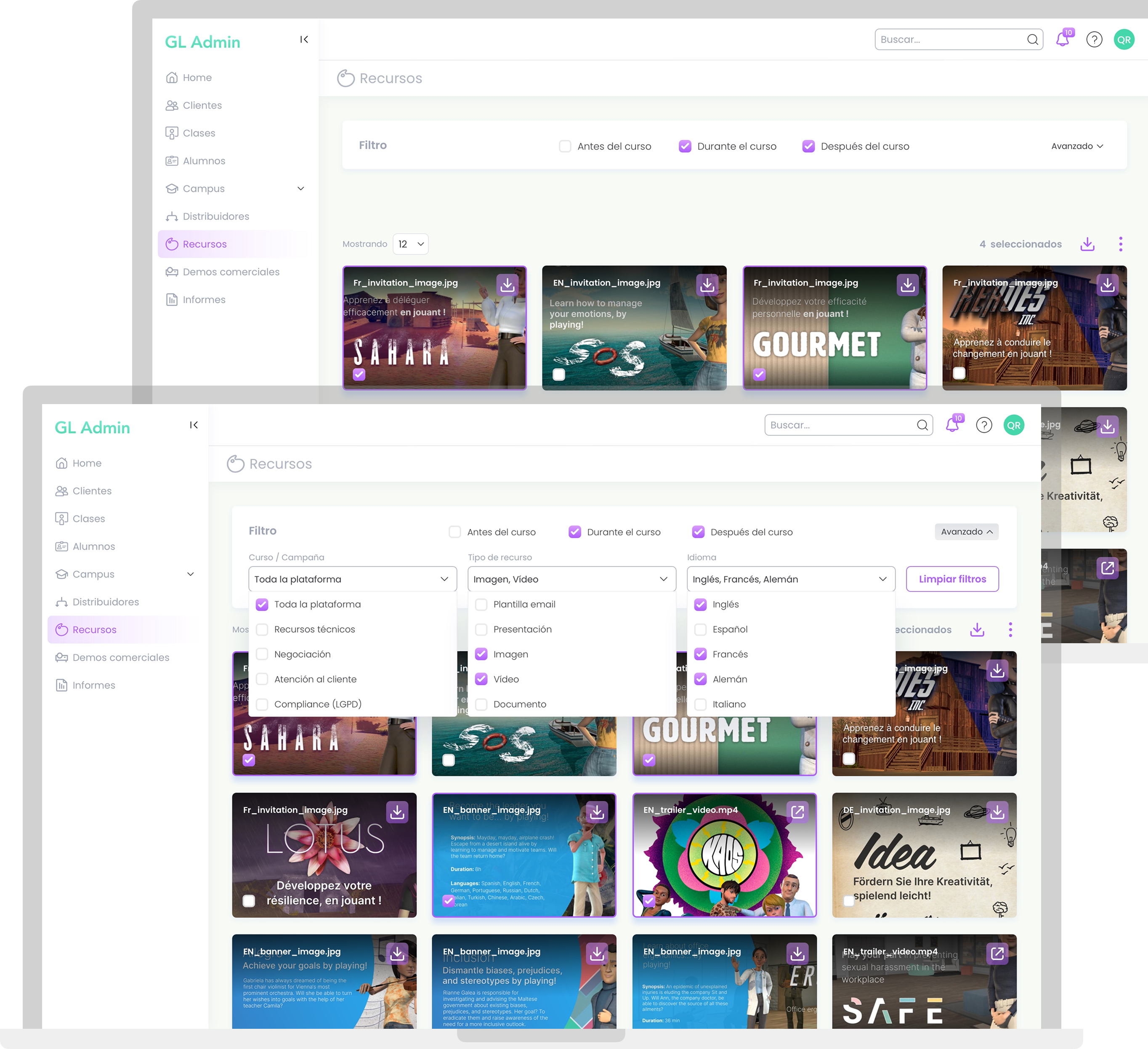
UI design
The goal was to solve the functional proposal in an organic, scalable way that is easy to assimilate at first glance, but sticking to UX properly. To complete filtering, the grid allows for different number of cards to be displayed at the user's discretion, and hovering is eliminated to make operation clearer, avoiding the "visual dance" between components, and managing to accompany the learning curve.
Takeaways
Be holistic, my friend
Addressing the usability of a large project by analyzing the needs holistically, will allow for a usable and intuitive sitemap and navigation system in the future.
Less is more, but...
Limiting interactions in complex flows can make the experience friendlier, but reducing them too much will make the tool look (and be) less robust.
Listen up, filter down
Stakeholders must be listened and understood to empathize, but being clear that they will almost always seek not to optimize, but to maximize their use of the different features. This can lead to unnecessary complexity, both in design and at a technical level.