
Problem
Although companies invest heavily in training, the actual impact is often not as expected. Traditional training sessions and workshops tend to be sporadic and impersonal, and the effectiveness of static materials in preparing participants for real-life situations is difficult to measure. This results in infrequent practice, difficult-to-act-on feedback, and struggle in adapting training to different levels and contexts.
Solution
Roleplay is a gamified training tool based on conversational AI. It allows realistic situations with interlocutors to be recreated in a safe, controlled environment. All owned from an external platform for creating and managing contents and user players.
Role
Following a market status analysis by Business stakeholders, which would yield an initial approach to product requirements, I am tasked with proposing the sitemapping and full functionality to both simulation tool (web app) and management platform. This last one is to be hosted on GL Admin.
What I did
- Qualitative UX research: user interviews and observation. Usability testing. Tools: Google Meet, Docs.
- Conceptualization and ideation (flowcharting + sketching). Tools: Hand drawing, Draw.io
- UX/UI design (wireframing). Tools: Figma + Marvel app
- Prototyping at different levels of detail. Tools: Marvel app
- UX/UI – Dev hand off and iterations follow up for MVP, Beta and releases. Tools: Zeplin, Jira, Confluence, Asana
Discovering needs
Goal
A user with declared communication needs can improve his or her soft skills by engaging in conversational simulation.
User personas
For both Player and Creator-administrator profiles:
- Average tech profile.
- Informal use of apps and gaming.
- Regular use of calls or video calls.
- Occasional AI querying use.
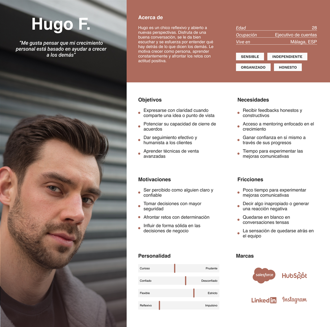
User persona: Player
Salespeople, support staff and consultants who want to:
- Meet sales targets and close deals.
- Manage incidents and resolve issues.
- Boost their confidence in interviews.
- Improve their social skills in their day-to-day work.
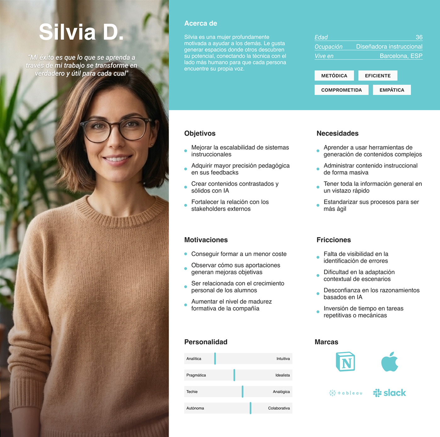
User persona: Creator-administrator
HR managers, motivational coaches, team leaders and product managers with little or no time for training and aiming to:
- A data-driven impact in the soft skills of their crews.
- Refine their feedback system.
- Manage internal conflicts.
- Improve stakeholders management.
- Strengthen emotional management.
User stories
As a player:
- I want to practise having realistic sales conversations to boost my confidence.
- I want to interact with different types of customers in order to prepare myself for real-life situations.
- I want to receive immediate feedback after each session.
- I want to repeat scenarios to improve my performance.
- I want to identify any skills I am lacking.
- I want to attend short training sessions that fit into my daily routine.
- I want to see my progress over time.
- I want to receive personalised recommendations for improvement.
- I want to be able to train without feeling assessed by others.
- I want the conversation to flow naturally.
As a creator-administrator:
- I want to create customised sales scenarios.
- I want to adapt scenarios to different sectors.
- I want to set clear goals for each role-play.
- I want feedback to align with each session's goals.
- I want to adjust the difficulty level of conversations.
- I want to set performance evaluation criteria.
- I want to analyse common error patterns.
- I want to be able to manage users easily.
- I want to have visibility into product usage.
- I want to measure the sessions' impact.
- I want to scale the product while reducing operating costs.
- I want to ensure data security.
Some good design choices
Conversation as main UX
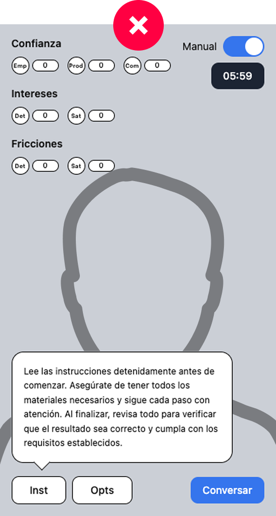
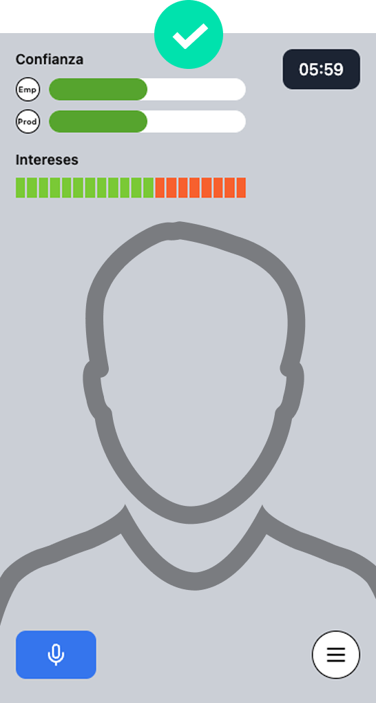
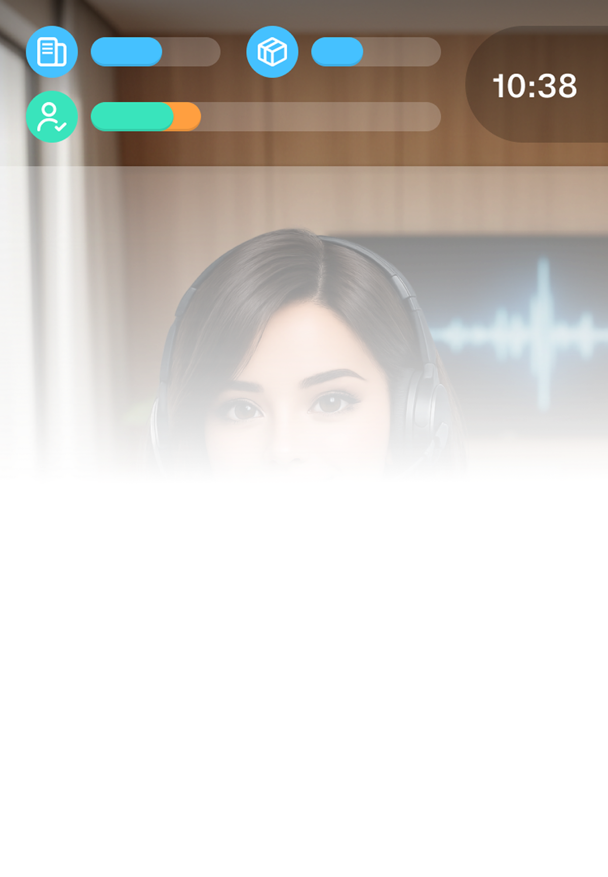
Even in the first usability test with player users, in which the scenario view featured several floating components, three key reactions were observed:
- The testers diverted the focus of the conversation.
- They hesitated more before responding.
- They became less natural in their speech.
Rather than helping, the UX broke the simulation. This allowed to better understand that the product core is the conversational practice itself. A congested functionality will distract the user, affecting the UX.
I applied Hick's Law to prioritize conversation, keeping interaction to the minimum necessary.
Combined feedback
The CPO's initial idea on this topic was to devise highly visual feedback for conversations, highlighting successes and mistakes, and encouraging further discussion. The sales team and future testers were involved in some informal chats about this matter:
"I don't know if that's going to ruin the mood."
"I think I'll be thinking more about getting it right than talking."
"It doesn't seem natural to me."
Even before tackling the design, it was clear that constantly interrupting the conversation would affect the flow. The goal became to enable efficient reflection without disrupting immersion.
We propose feedback in two phases: during the session, a gamified non-numerical scoring system that grows as the player unlocks key information. At the end, a downloadable report analysing performance through KPIs focused on different conversational aspects.
Avoid group competition
During a brainstorming session with the dev crew, the idea of introducing a ranking system arose, based on motivating player users through gamified mechanics while still focusing on soft skills. The CTO agreed to include it in the MVP as long as the development cost was less than one sprint and would not generate technical debt.
During the first iteration with testers, it was found that:
- Users skipped complex challenges to protect their position.
- They aimed for the shortest route to earn points (e.g. using single words as keywords instead of complete answers).
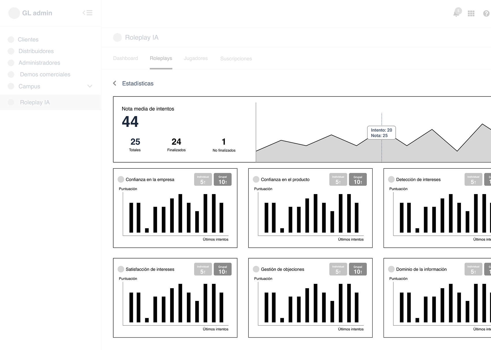
It became clear that competitive pressure can undermine honest practices and distract from skills development. As an alternative, a stats dashboard showing individual and group averages is proposed, enabling player users to track their progress in a positive way towards better mid and long-term concept acquisition.
A catch: the conversational experience
Problem
Active listening, empathy, persuasion and emotional management are all essential skills for professional development in many social environments. However, people lack consistent or reliable opportunities to train these skills.
This can lead to frictions such as fear of judgement, or delayed, not actionable feedbacks.
Solution
A functional proposal for an AI-based conversational simulation that enables users to hone their communication skills in realistic, contextualised scenarios.
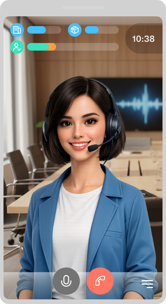
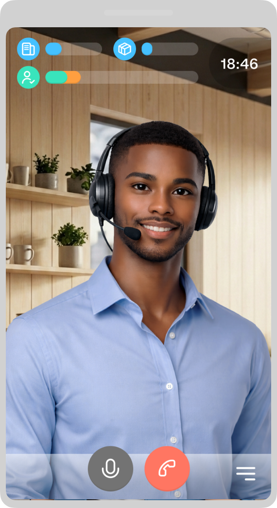
The product recreates a videocall environment and generates dynamic dialogue with a virtual interlocutor who responds in real time, adapting to the user's speech, tone and decisions.
After each session, the user receives a structured report combining clear metrics with qualitative feedback to help them understand their strengths and areas for improvement, but without turning the experience into an exam.
UX flow
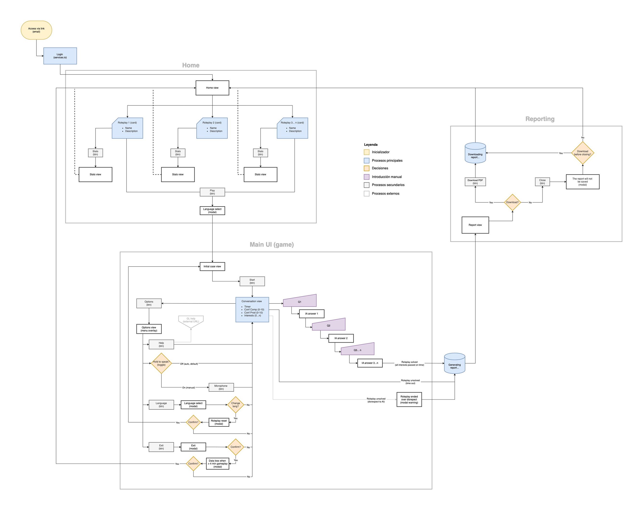
The functional proposal primarily focuses on effectively separating the consultation and conversation parts. Once this has been achieved, the user can immerse in the roleplay experience through a sequence that makes the cognitive process as smooth as possible, enabling focus on responses from the outset.
The main premise is to maximize player user retention and ensure a structured learning experience through modularity. To achieve that, each roleplay is contained within a card (Roleplay 1, 2, 3...), allowing for easy scalability of content.
The videocall is the heart of the prototype, where the interaction logic is tightly controlled to prevent user frustration.
The logic accounts for "Solved," "Unsolved" (Time out), and "Ended" states, all funneling into the reporting engine.
UI design
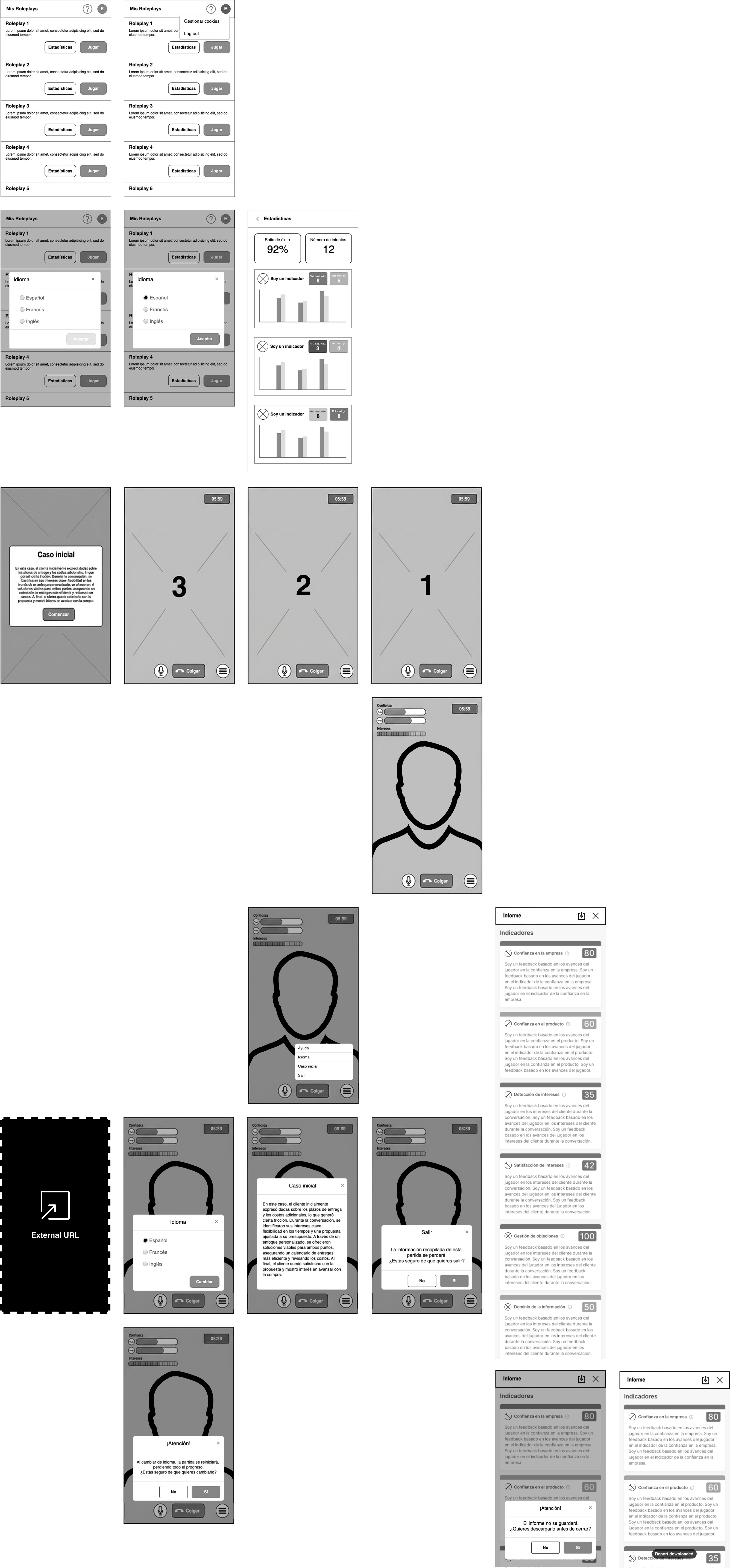
A progressive training strategy is suggested to keep focus on the main task. During the conversation, semantic tokens communicate success and failure states, enabling intuitive progress within a minimalist learning-focused approach.
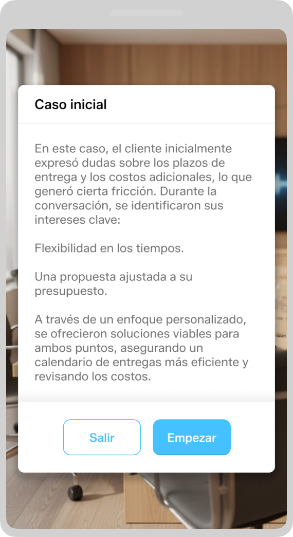
Initial case
A modal window provides the player user with relevant information about who will be talking to in advance. This helps to focus the conversation and set expectations. In terms of interaction, functional friction is minimised by providing a single CTA.
Scenario
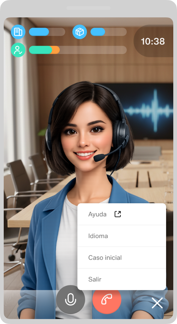
Throughout the conversation, the UI remains clean and focused on the dialogue, displaying key indicators in real time.
- Trust in the company / product. These measure the user's incremental engagement with the interlocutor.
- Interests. It indicates whether the user meets the interlocutor's priorities and needs in a segmented manner. When discovered, they are displayed in orange and turn green if they are satisfied.
This allows the player user to understand the impact of questions and answers without interrupting the conversation.
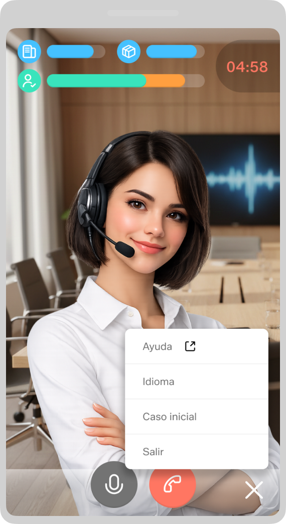
Options
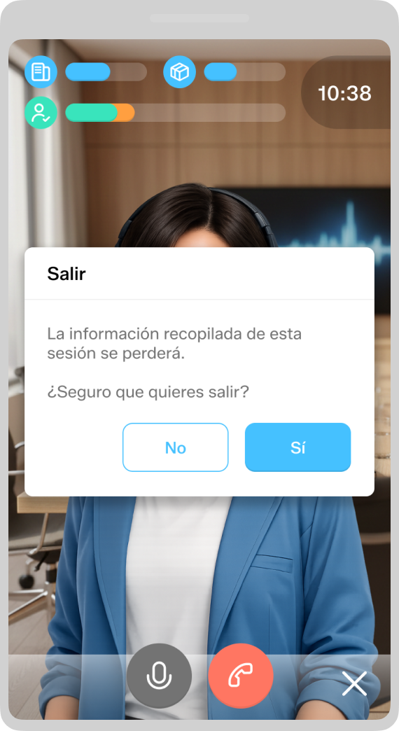
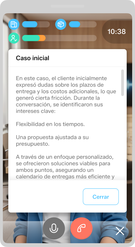
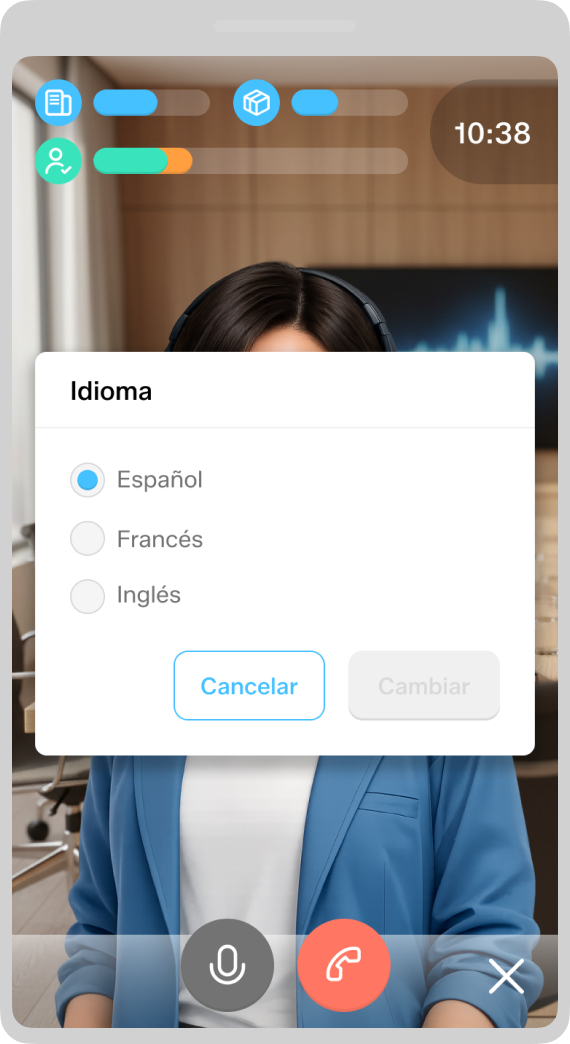
Various contextual features are accessible without overloading the main UI. These features are provided in the form of dialogs, with confirmation required where necessary.
- Help. Links to an external FAQ.
- Language. Changing the language resets the session and returns to the initial case in the selected language.
- Initial case. Retrieves general context for consultation.
- Quit. End session without saving data.
Report
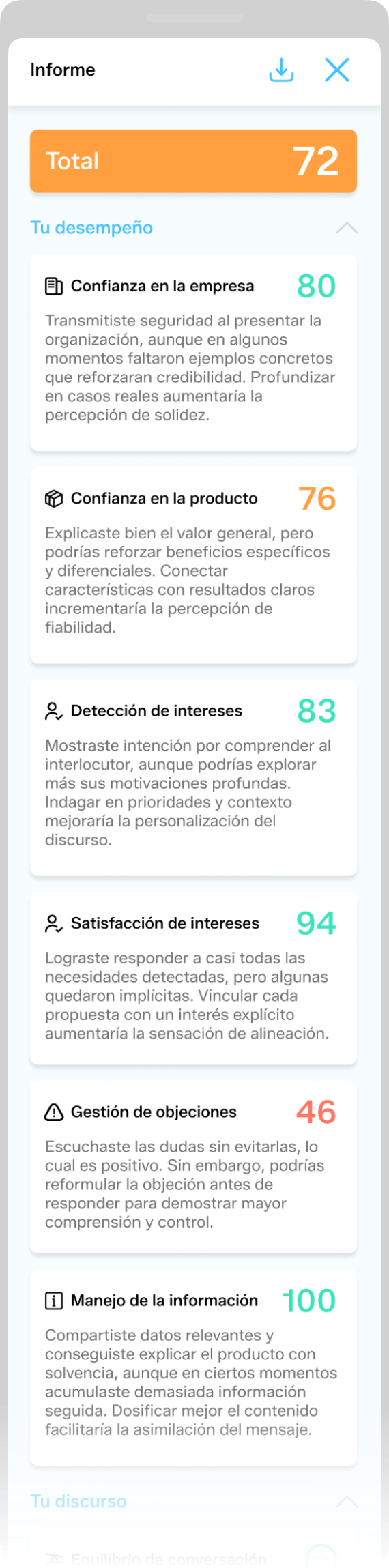
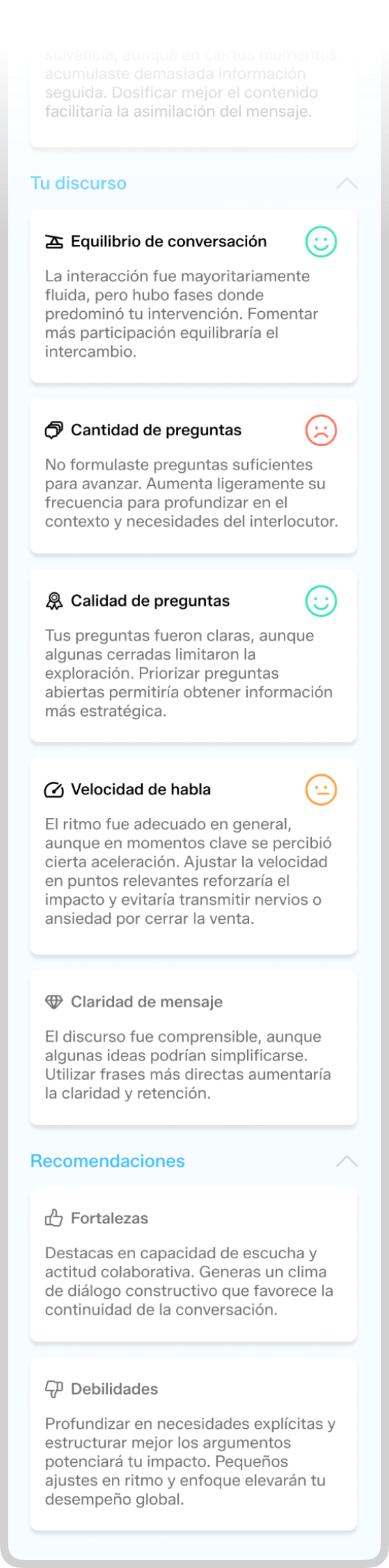
For wrapping up the simulation, the player user receives a performance report, which concludes the experience by promoting learning and improvement. It presents well-reasoned arguments in a constructive tone. By refraining from making value judgements, it facilitates reflection.
The report is structured in one scroll as follows:
- Average score (0–100)
-
General indicators (0–100)
- Confidence in the company and product
- Identifying and satisfying interests
- Handling objections
- Mastery of information
-
Speech indicators (Emoji-based assessment 😞 😐 😊)
- Conversation balance
- Quantity and quality of questions
- Speech rate
- Clarity of message (not assessable)
-
Qualitative recommendations (not assessable, learning-oriented)
- Strengths
- Weaknesses
 Mobile
Another catch: the training management
Problem
Alongside identifying the needs of the player user, it is crucial to monitor their progress in a scalable and holistic manner that would allow to accompany the user journey and anticipate any training obstacles that could undermine progress.
Solution
A platform has been defined for content creation, customer management and player users, operating within the GL Admin umbrella but as a completely independent and companion app to the main product. There are two operational levels, depending on the role:
- Customer Success. This is the most in-depth level, aimed at roles responsible for global customer follow-up. It enables the management of games and player users for each customer, as well as the creation of content from scratch and access to the dedicated player database section.
- Client Administrator. We could say this middle level is a lighter version of the CS one, designed so that customers can control their own content and player users, but with no access to others data.
UX flow (CS)
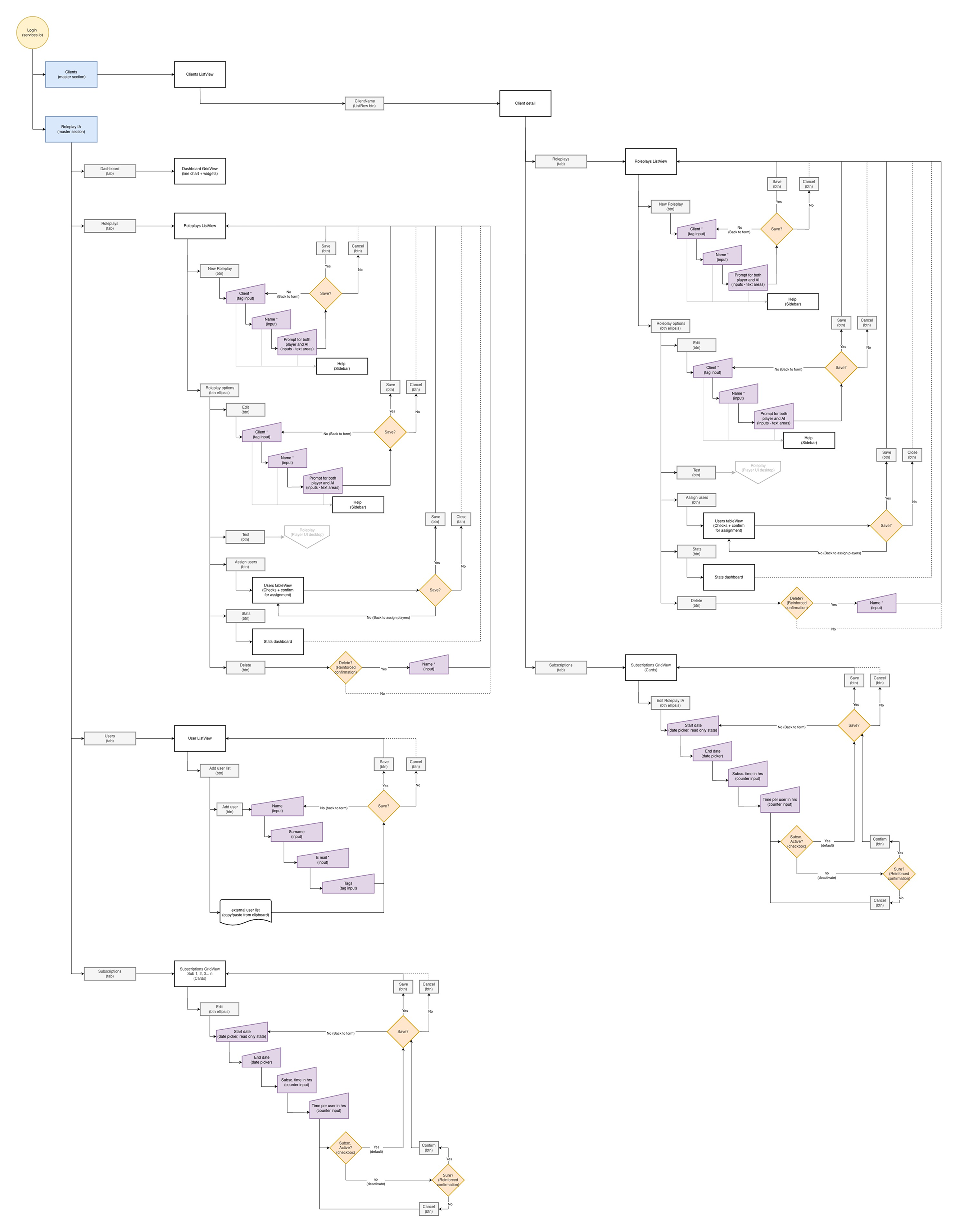
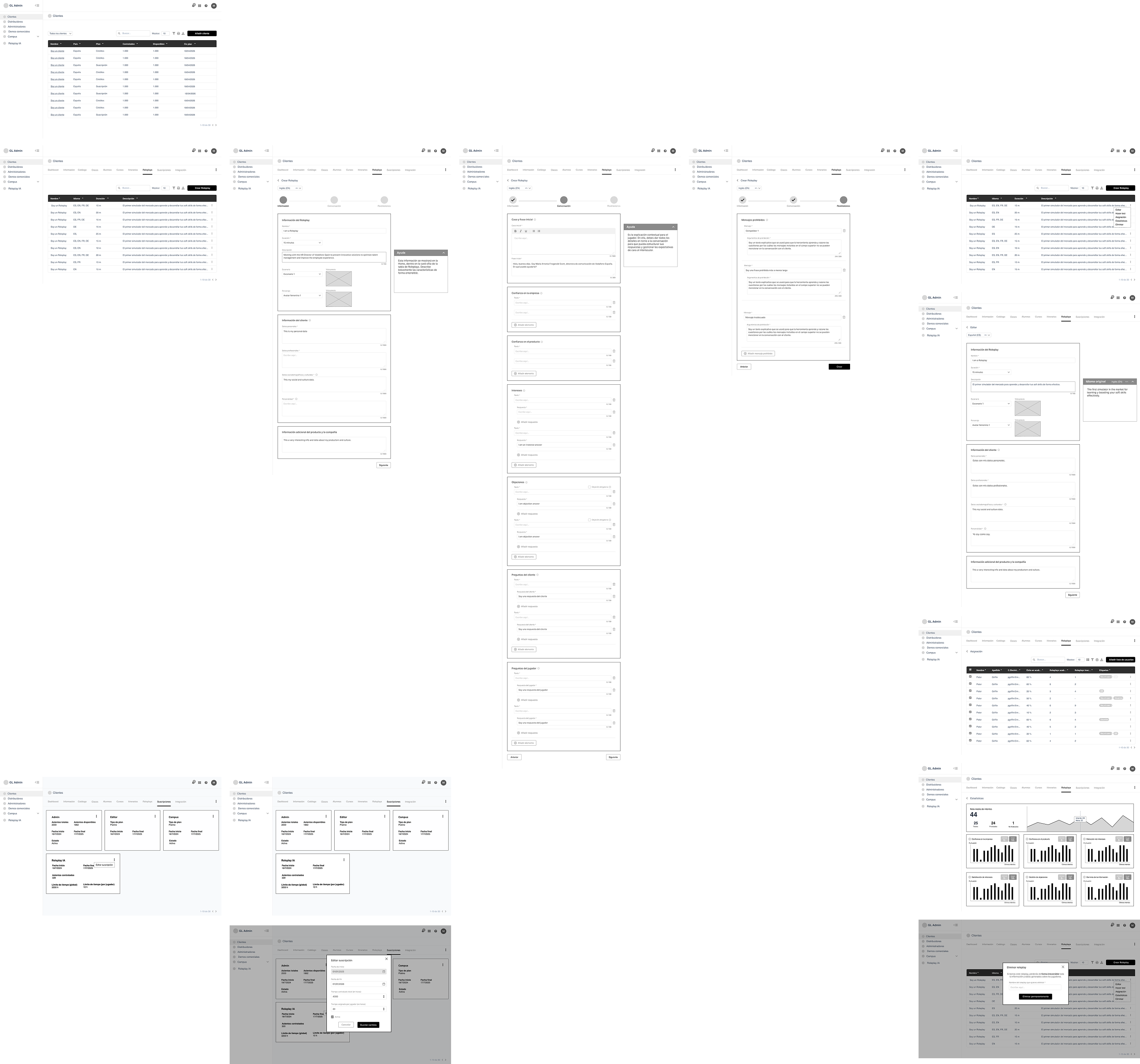
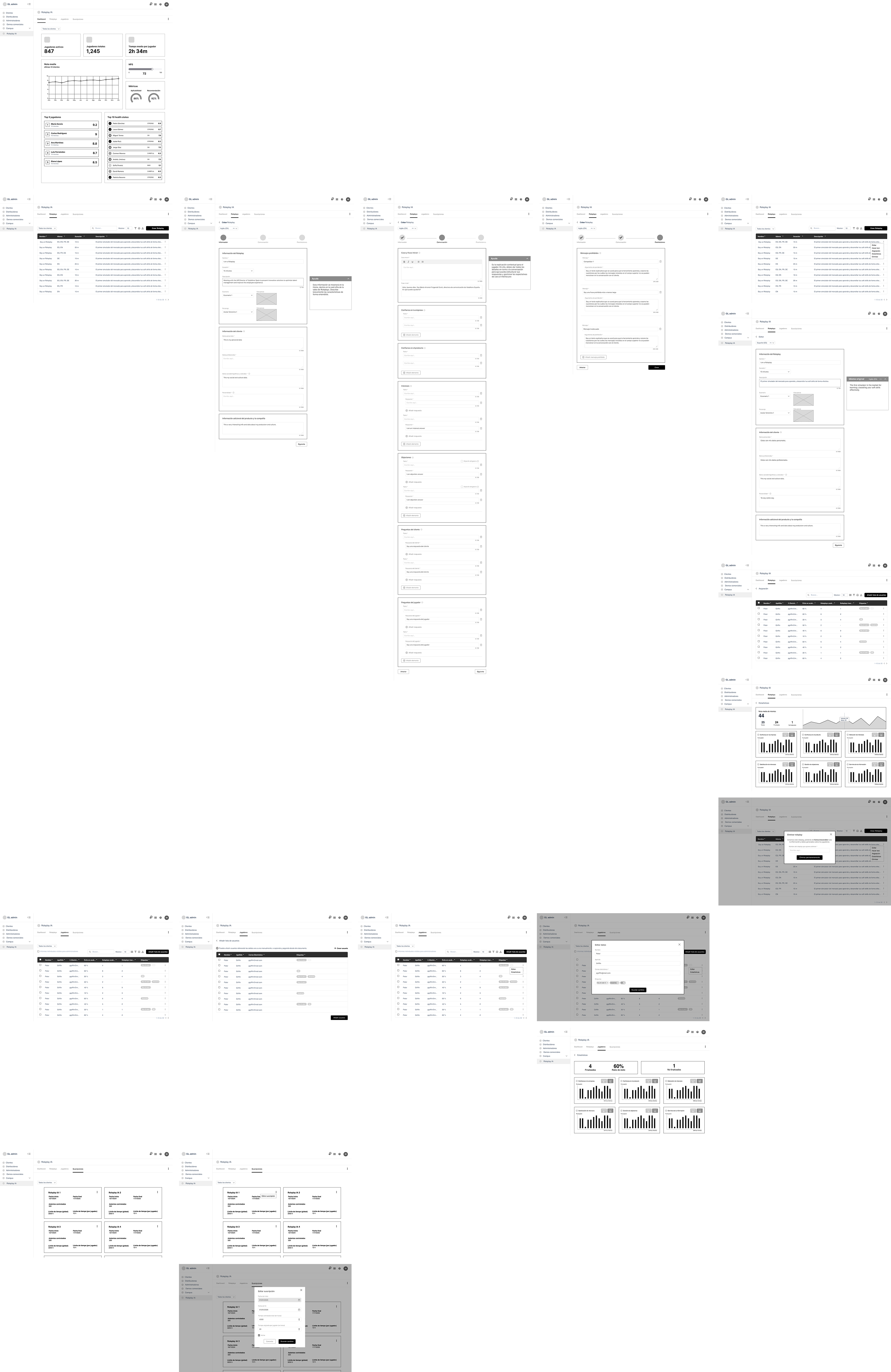
Simplifying the diagram's processes also leads to a flow focused on optimizing the experience. In this way, we see similarities between the customer detail and the Roleplay AI master section, which are translated into views that are very similar in terms of functionality. Although this may seem redundant, it enables the reuse of code and allows the creator-administrator to more easily ensure operational control.
UI design
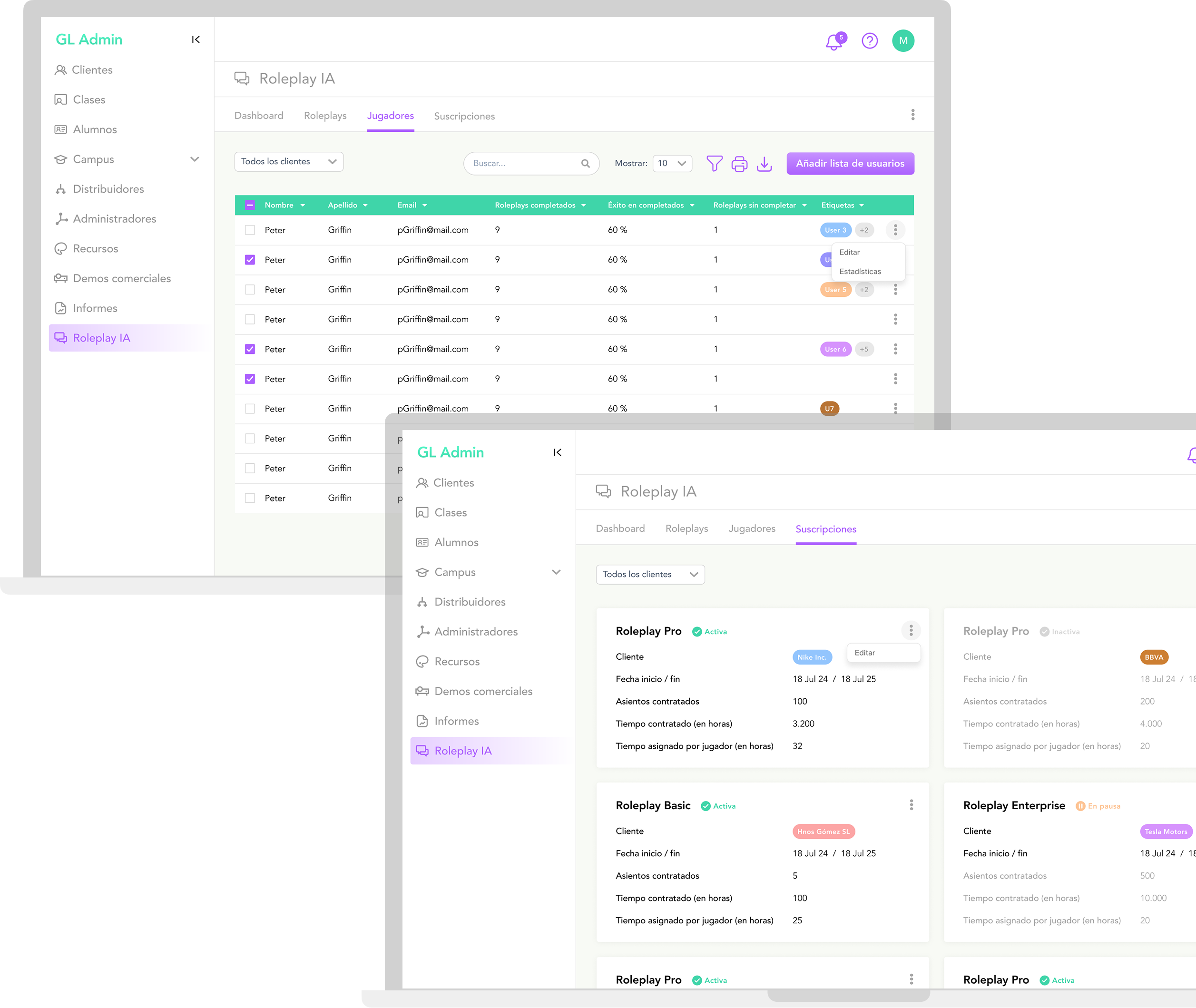
The aim is for hierarchy to play a key role in relation to data. Different types of grids and context modes minimize operational friction, providing management with full visibility and control of the platform while maintaining the user's focus.
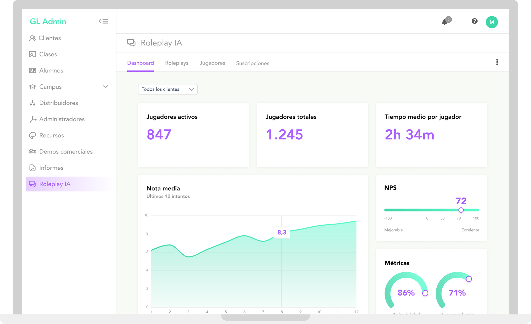
Dashboard
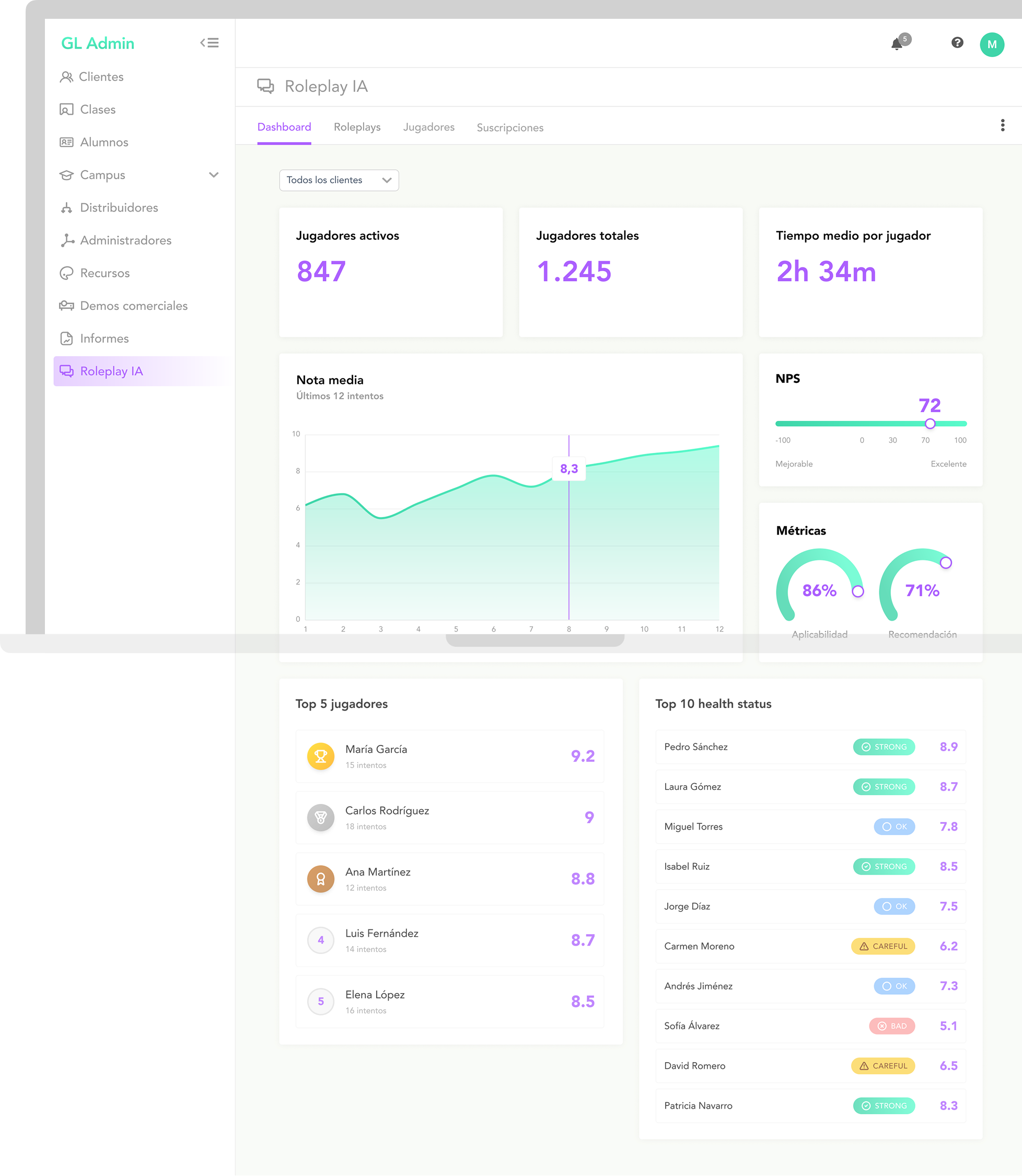
A complete summary of activity, metrics and player user status, filtered by customer, is provided through a series of widgets arranged in a three-column grid. The importance of the information determines the visual weight of each widget. The general idea is to balance between components and spaces for an accurate, error-free understanding of what is happening. Simple animations would be proposed to accompany the evolution of the data showed in graphics.
Roleplays
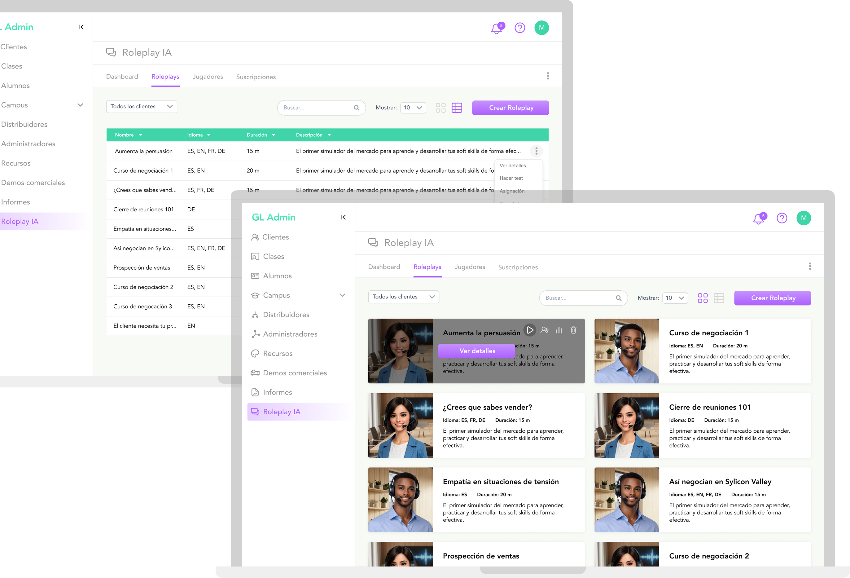
The Roleplays tab facilitates control and administration of all ongoing sessions from a general perspective, including editing and testing features. Once inside, two views allow to show contents according on administrator preference: Grid, if want to go more visual, and Table, rather practicality-oriented.
User players
Working almost like a microsite itself, it offers a feature that allows users to add, edit and delete accounts, either individually or in bulk, both in games that have already been created and freely for later assignment. This streamlined process eliminates unnecessary steps and interactions that would otherwise slow down the process.
Subscriptions
The visual architecture employs a grid card to organise subscriptions in a modular fashion. This layout makes it easier to have an accurate overview of the general plan status.
Modal overlays, which are activated via context menus, avoid subviews reducing friction while preserving the user's navigation context. Integrating them into both the customer detail and Roleplay AI master section ensures consistent, centralised management of the platform across modules.
Takeaways
Lather, rinse and repeat. Always repeat
When it comes to design for enhancing soft skills, good UX is measured by how often the product is used. Enabling users to practise more often with less friction is key.
User don't give a **** about biz
Designing user-center-based without understanding the expected business impact generates products that may appear correct, but will ultimately be irrelevant.
Happy flow = happy code
Defining a clean and simple flow enables devs to implement it with less ambiguity and detect potential scaling issues in advance.